Dear Kaiju users,
We are excited to announce an upcoming new feature that allows you to visualize your data on Kaiju: the Data Visualizer.
This tool will transform your raw data into clear graphs. You can either copy and paste your data in hexadecimal, binary, and pulse format into the input box, or you can visualize previously captured data in the Captured Input Data section of your Remote!
Visualize data through the Data Visualizer tab
With this option, you simply need to paste the data you want to visualize in the input box. Go to the Utils tab and select Data Visualizer.
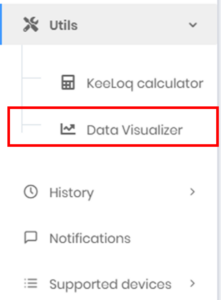
Data Visualizer in the Kaiju menu
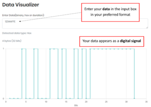
Data visualization in hexadecimal format
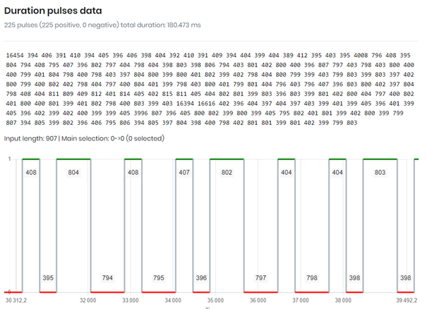
You can also paste your data in binary or duration (aka pulse) format, it will automatically be displayed on the graph.
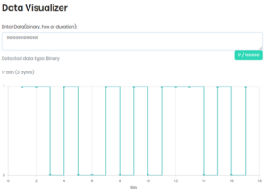
Binary format graph
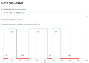
Pulse format graph
You may input a maximum of 10,000 characters.
Visualize data of a previous Kaiju analysis
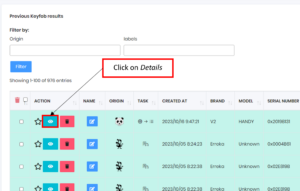
This option requires that you have captured data and analysed it with Kaiju. It is available for any data sent to Kaiju. For example go to the Keeloq/Custom tab of the History section.
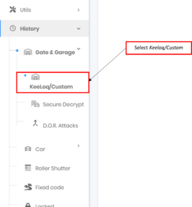
Keeloq/Custom tab in the menu
Choose the captured remote you want to visualize and click on the Details icon.
You will then have to Click on Captured Input Data where all the information about the capture is reported.
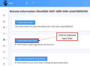
Captured Input data section
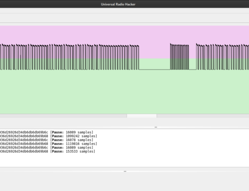
Scroll down the page and the graph will appear!
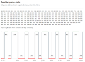
Graph of previously captured data
We’d love to hear your feedback and suggestions. Contact us through our Discord page or send us an email.
TL;DR
- New Kaiju feature enabling users to visualize data (before analysis) in hex, binary, or duration.
- Captured data can also be visualized as a graph (after analysis) .